Design That Energizes: How I Brewed Up Invigor8’s High Protein Coffee Packaging
Where high-quality coffee meets high-end design: no clutter, just caffeine and protein perfection.


The Story Behind the Bag
When Invigor8—known for their premium supplements like protein shakes, collagen, and burners—decided to add High Protein Coffee to their line, they came to me with a clear mission:
Make it clean. Make it bold. Make it fit.
Their products are top-notch, crafted with high-quality ingredients that fitness enthusiasts love. But their existing packaging? Let’s just say it was a little… crowded. You know the type—labels packed with so much information, you need a protein shake just to muscle through reading them.
This time, the goal was different:
Appeal to the health-conscious crowd.
Simplify the look while keeping it high-end.
Design something that stands out in a sea of overwhelming competition.
The Design Process: High-End Meets High Energy
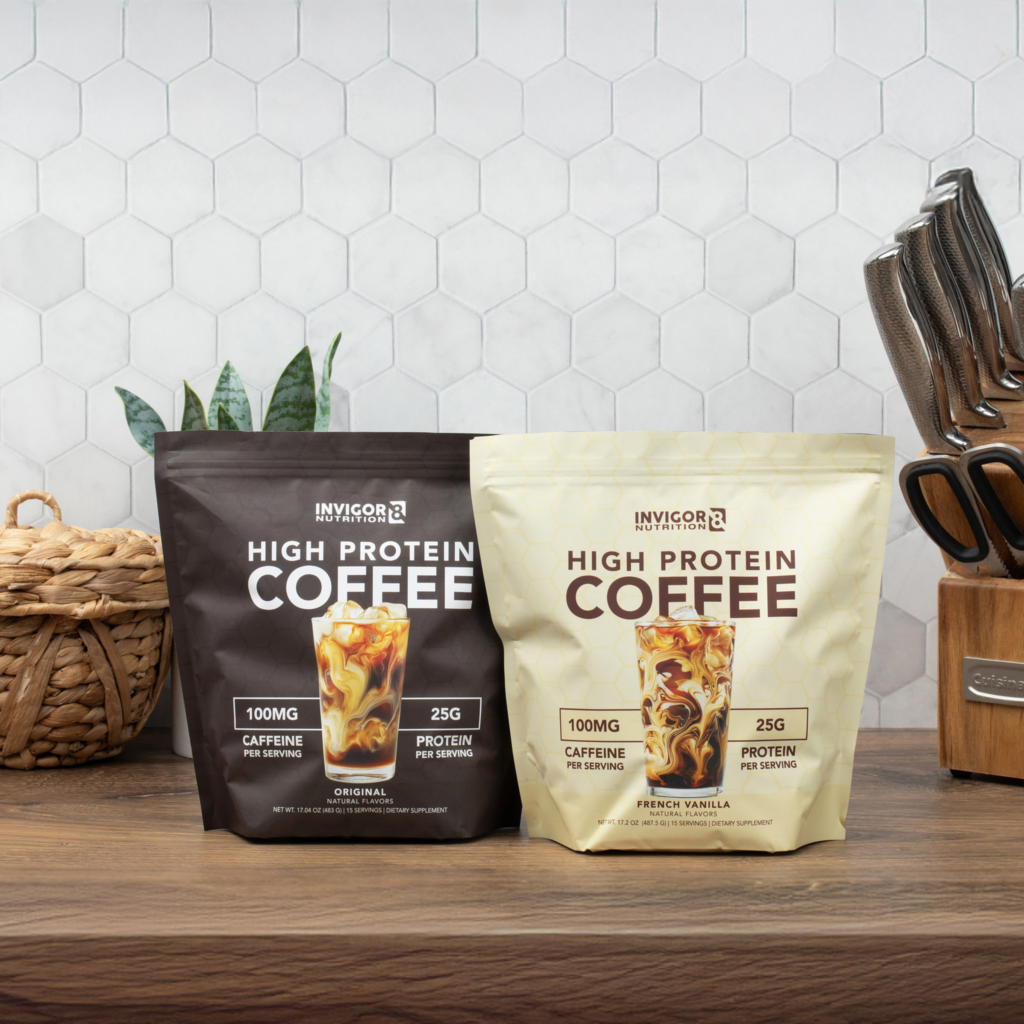
I started by elevating the overall feel of the product. A high-quality coffee with 25 grams of protein and 100 mg of caffeine deserves packaging that reflects its premium nature.
Here’s how I brought it all together:
The Color Story
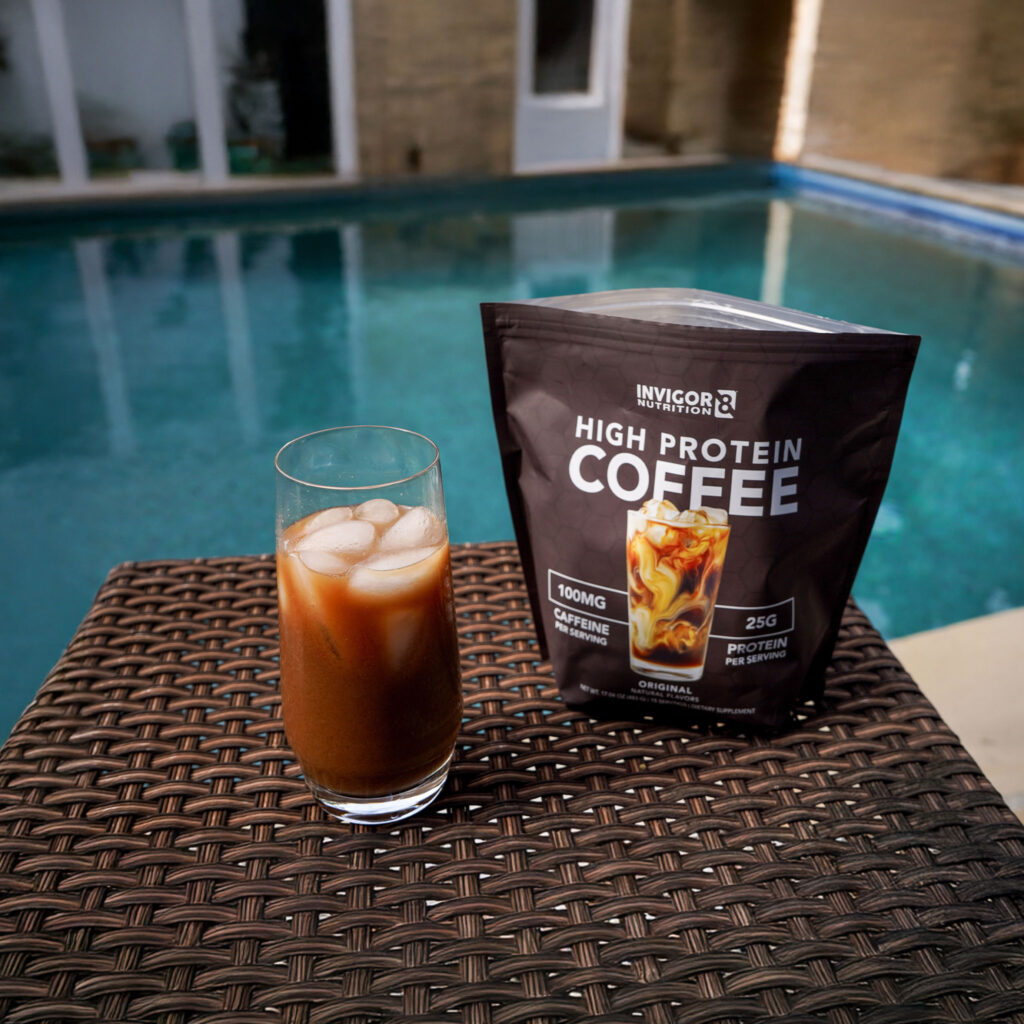
For Original, I chose a dark, rich brown to evoke classic coffee vibes.
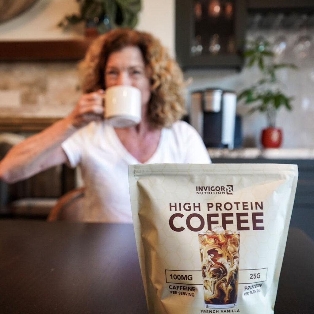
For French Vanilla, I leaned into a creamy, off-white tone—smooth, inviting, and unmistakably vanilla.
The Hexagon Touch
Invigor8’s brand features a subtle hexagon pattern, and I wasn’t about to let that sit on the bench. I incorporated it onto the front of the bags using white ink—just enough to make the pattern pop without overwhelming the clean design.
The Iced Coffee Moment
Sure, this coffee can be enjoyed hot or cold, but let’s be honest—iced coffee sells. The front of the packaging features a beautifully swirled iced coffee glass, complete with ice that barely overlaps parts of the word “COFFEE.” Why? Because that little detail creates depth and makes the product feel alive like you could reach in and take a sip.
The Results: A Buzz-Worthy Bag
The product officially launched this week, and while sales numbers are still brewing, the pre-launch buzz was strong. People are excited. And as any designer knows, when the client’s excited, that’s the sweet spot.
Why It Works
This packaging hits the mark because it speaks to its audience:
Fitness-focused coffee lovers want a product that’s functional, approachable, and premium—just like the bag itself. The clean design ensures that the key benefits (hello, protein and caffeine!) stand out while the details, like color and patterns, reinforce the high-end quality.
In short, the packaging feels as good as that first sip of coffee after leg day.
What’s Next?
I can’t wait to see how this bag performs on the market. For now, I’ll just be over here, sipping my coffee (high protein, of course) and basking in the glow of another project that just works.
Cheers to bold coffee, bold design, and bold brands like Invigor8 that know the value of good packaging.
Let’s work together on your next graphic design project.
If you want a brand refresh or you just need graphics that support your current brand, reach out to find out how I can help.


