Profit Engineers Branding
How I helped Profit Engineers build a brand for their accounting firm that is different for other accounting firms.

Project
Complete Branding Design Package
Software Used
Adobe Illustrator, Adobe InDesign, and Adobe Photoshop
Description
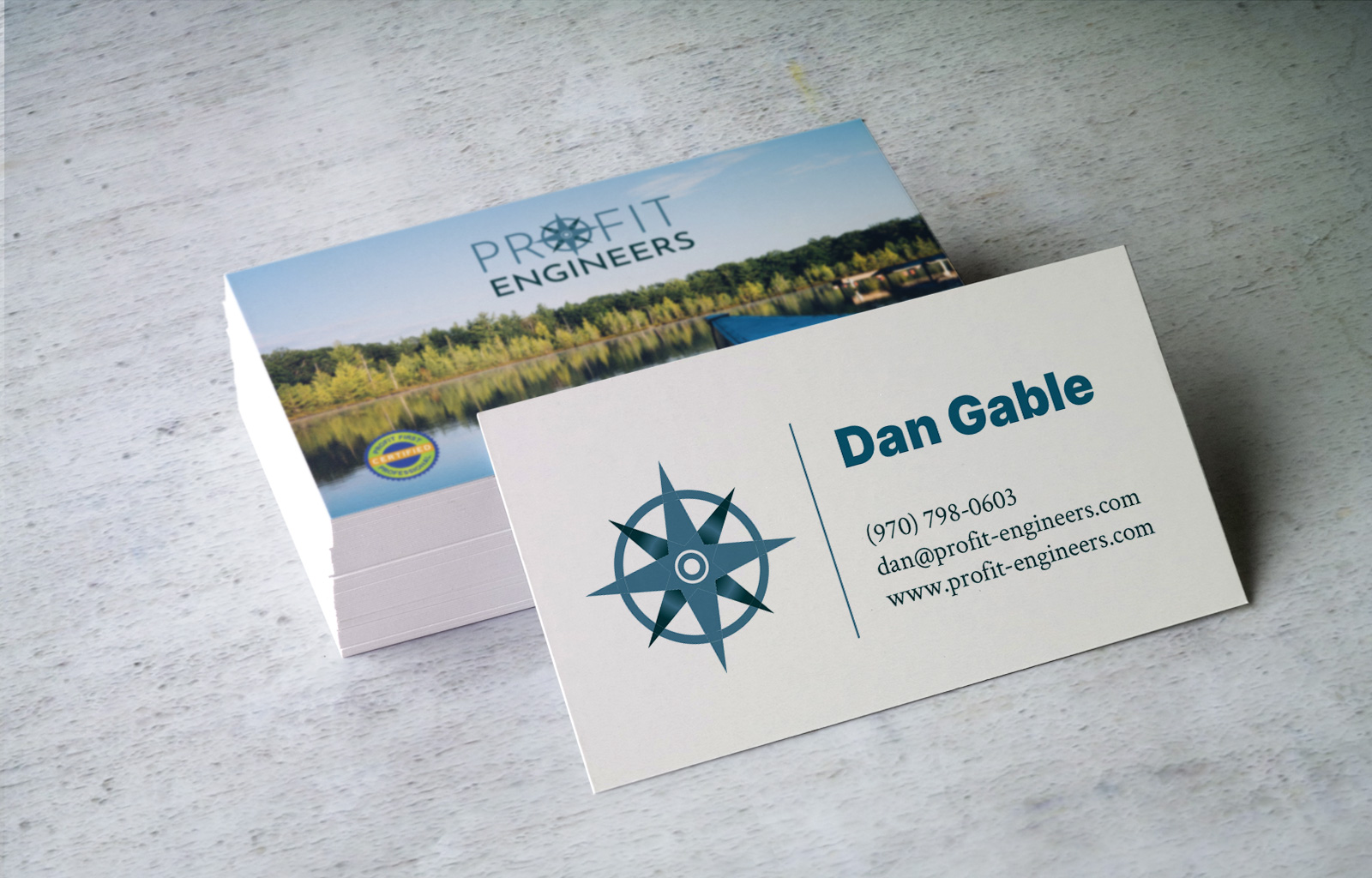
Profit Engineering, a Colorado-based accounting firm, needed a complete rebrand that broke away from the traditional, buttoned-up look of their industry. Their vision was a brand that captured their adventurous spirit and love for the outdoors.
The centerpiece of the design is the “O” in Profit, which serves a dual purpose: it resembles a compass, symbolizing direction and exploration, while also subtly nodding to the look of cockpit instruments, evoking precision and control.
This fresh and unique branding reflects Profit Engineering’s personality—professional yet adventurous—and sets them apart in the world of accounting.


Let’s work together on your next graphic design project.
If you want a brand refresh or you just need graphics that support your current brand, reach out to find out how I can help.